
Layout | Design | Illustration
Improving the User Experience of a Print Collateral Piece.
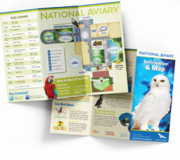
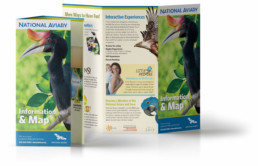
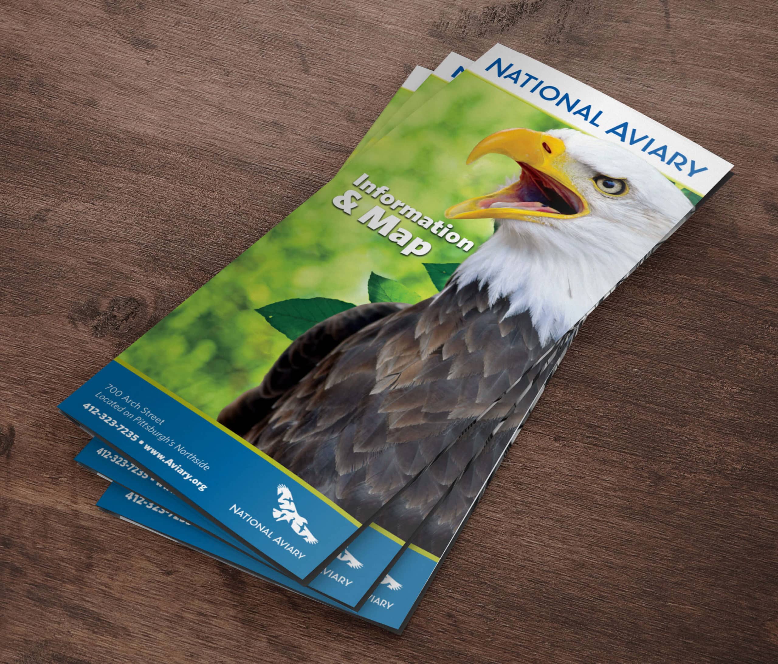
For the National Aviary, the facility map was their most important piece of collateral, not only to serve as a way-finder but also serve information about the different programs they offer and entice visitors to become members. This piece had become so large with too much information and too cumbersome to use that they had asked me to look for new ways to improve the experience.
Challenges
When I began working on the map the entire design was directed more towards the old target audience. The renovation and focus being on conservation brought about an opportunity for a more sophisticated approach.
Additionally, I identified several weaknesses including:
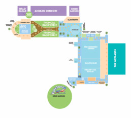
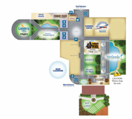
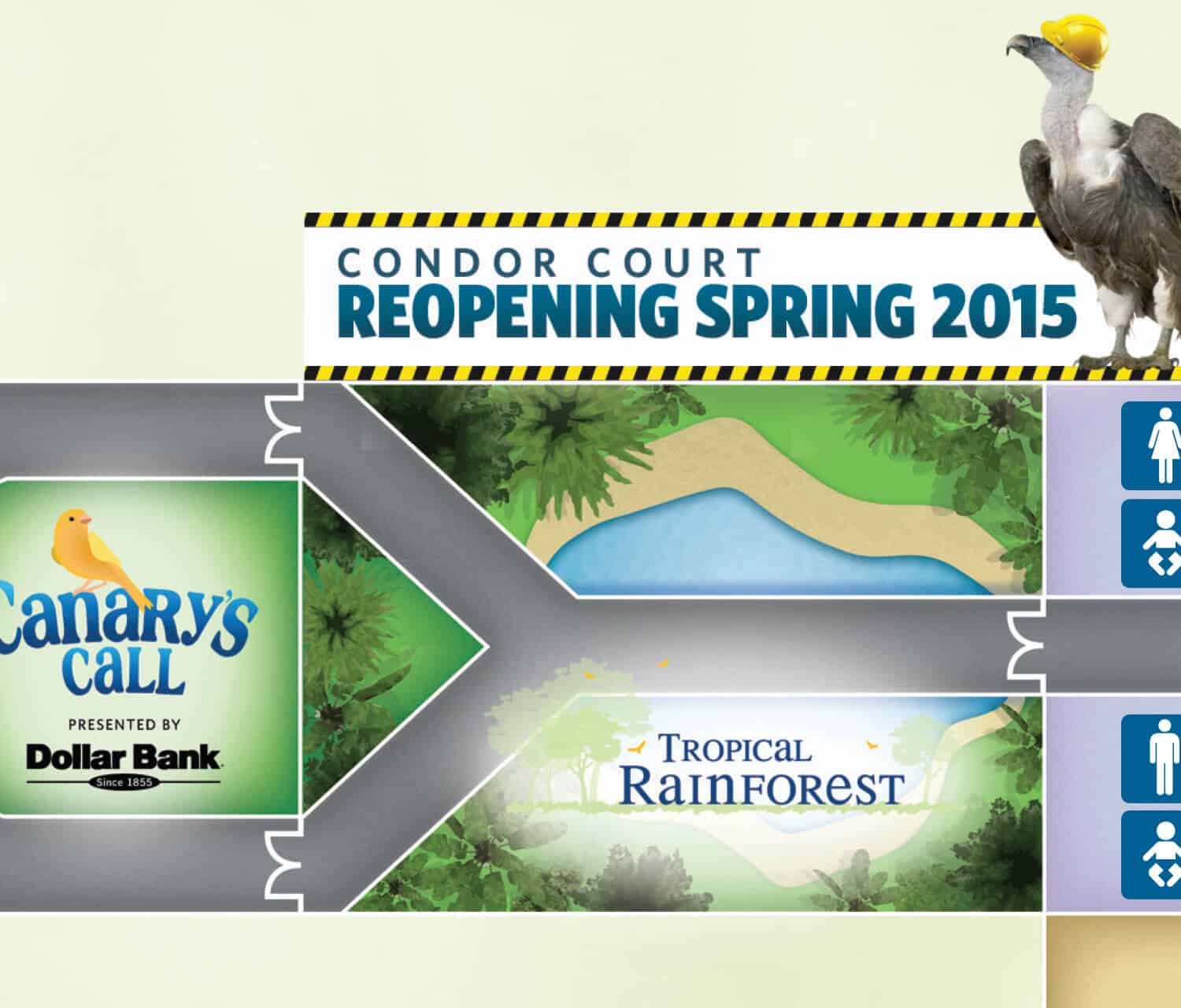
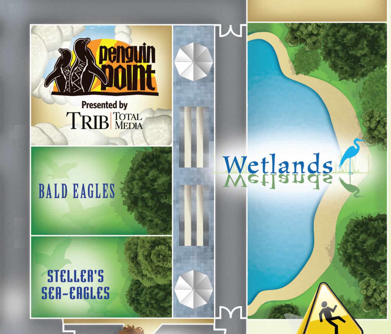
• The representation of spaces was confusing as to where walkways and doors were located. As an attempt to alleviate confusion, we added bird feet as directional representation, but this became more confusing as it created a cluttered look.
• The size was far too large, with anywhere from 6 to 8 folds opening to an 16″x20″ poster.
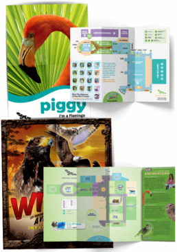
• The poster was a good concept, aimed at children as a part of a series that could be collected. In any given run, 4 different poster artworks were produced, increasing the print cost at the time.
• The position of the map, which was the most important asset, never seemed to fall in a good location that was easy to reference as visitors moved from exhibit to exhibit.
Solution
Illustrating the Environment.
The first thing that I did was create a design that was a little more realistic, playing off of the design of the environments themselves. By illustrating the walkways and doors, this eliminated the confusion and the need for directional indicators. I also included branding for each of the exhibits and natural elements that could serve as landmarks and increased the size of the important locations slightly so that people could find places such as bathrooms and information desks more quickly.
Application
Aligning to a shift in demographic.
With the design of the new map in place, I began working with the layout of the full print collateral piece for a better overall user experience, that ultimately was accomplished with a tri-fold. By achieving this smaller size it supported their mission of conservation with less paper usage and freed up more budget to use a higher-end recycled stock.
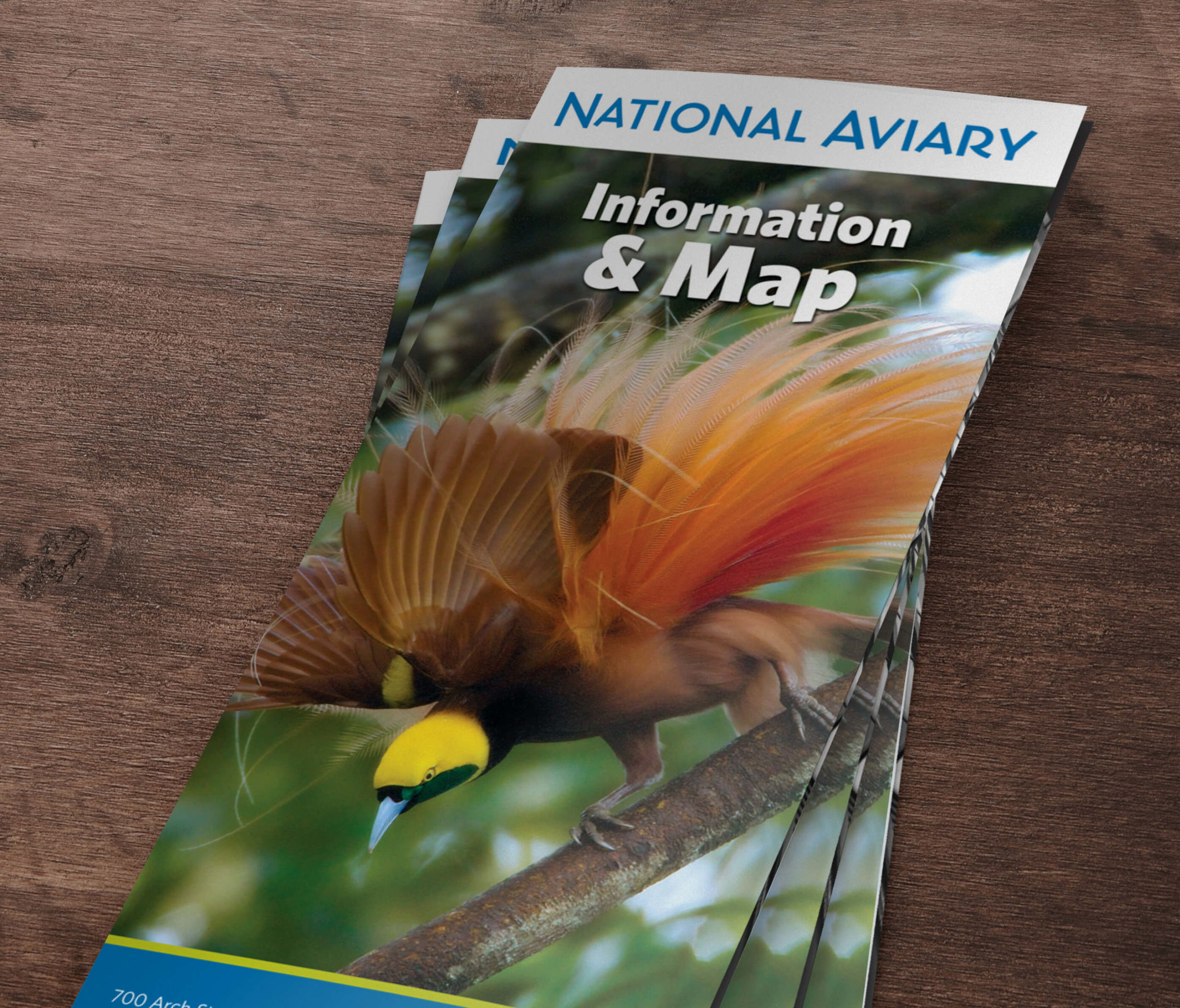
Working with average admissions numbers, we broke the orders out per season rather than as needed to reduce waste. With the new designs now seasonal, I took this opportunity to use the cover space to highlight a bird each quarter that was being featured through new exhibits or programs that season.
The National Aviary, located in Pittsburgh, is the only independent indoor nonprofit aviary in the United States. It is home to more than 500 birds of more than 150 species, many of which are threatened or endangered in the wild. It has one of the most diverse collections in North America.
ClientNational AviaryServicesIllustration, Layout DesignYear2012-2015
