Branding | Design System
Branding a County.
In 2007, the agency I was working with was approached by the county commissioners of Beaver to help them solve an identity problem. They wanted to begin advertising that Beaver County was a great place to visit, work, and live, but first, they had to solve the problem of all their departments, services, and bureaus looking completely different.
Challenge
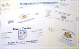
All of the departments, buraeus, and agencies in Beaver County were all creating and using their own stationary and collateral pieces. There were almost no common elements, and the county didn’t have an official seal as many do.
In addition to establishing consistency, they also needed to differentiate themselves from non-profits and other groups that bore the county’s name but were not part of the official government.
Solution
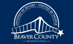
Divided by Rivers, United by People.
Beaver county has 390 bridges, which is almost as many as Pittsburgh (446 if you were wondering), and they wanted that to be their focus. They developed the tagline "Divided by Rivers, United by People" which springboarded the design process.
Ultimately we landed on a design that had the simplicity that it could be easily translated to their visitor’s bureau efforts, but also have a hint of a traditional county seal for official use with the local government and other departments.
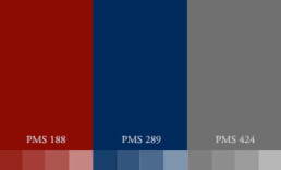
Since we used a more playfulness in the design, I incorporated colors most commonly associated with government, but a darker more dulled tone to being in higher sophistication.
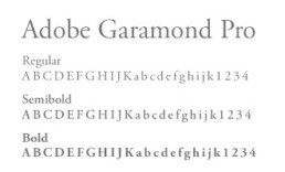
With centralizing something that was so historically decentralized, we wanted to make it as easy as possible to transition. For the official font to use in design as well as in correspondence using the stationary, we went with a font that was already widely accessible.
Application
Implementing the Identity.
To increase efficiencies and save on overhead cost, I created a series of letterhead and business card templates that could be adjusted as needed by each department with the county's print vendor of choice. With the amount of money saved, they were able to choose a nicer stock paper which helped elevate the sophistication.
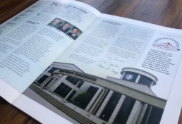
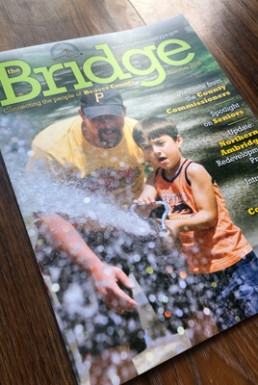
To support the brand and the tagline, I developed a template for a quarterly magazine to support the message of ‘United by People’. This publication was an opportunity for the commissioners to increase transparency and to share what’s happening in and around the county.

