
WESCO Digital Brand Guide
Branding | Design System
Digital Design Continuity Under One Brand.
When I began working at WESCO, I was a foundational member of a newly formed Digital Marketing team. We were tasked with bringing all of the marketing activities that were being developed independently by dozens of subsidiaries and markets under one platform for inbound marketing and automation. At the time there was no official document or process for managing brand.
Challenges
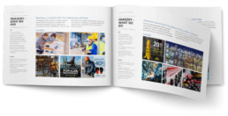
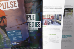
My first task was to take a holistic look at what was currently being produced, both in digital and in print. I captured as many elements as I could and began working to identify what patterns and similarities were being used already to establish a base to begin building on.

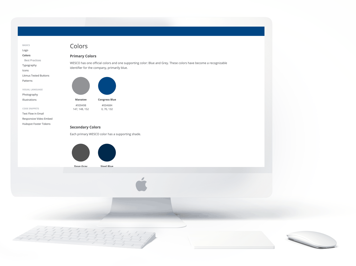
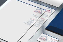
When it came to the color palette, I identified nearly 80 different colors being used, the majority of which being different shades of blue and gray. The blue that was being used in print didn’t translate well to web. In additional, many of the acquisitions were maintaining their existing brand and colors.
Oportunities
Not just in colors, but in numerous other elements, there was an opportunity to align the visual language when representing WESCO. The content and target audiences were vastly different, but by implementing some key design elements, it could greatly benefit the company to begin making everything look unified under one brand umbrella.
There existed a wide-open range of opportunities to pioneer programs that have not only never been done within WESCO, but also within the B2B space. Competitors were adapting to the ever-changing landscape of the ways their customers and sales repts interact with them daily, but were also in their early stages.


Solution
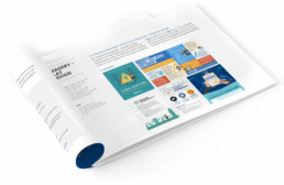
Comprehensive style guide.
Traditionally just blue and gray, WESCO needed a palette that would not only align the business with the subsidiaries but also stand apart from the competition, most of which companies were also blue and gray. The secondary colors I chose encompass colors and tones across the entire business while paying attention to the harmony between colors and their web-friendliness.
WESCO has a number of logos that are used. For the purpose of digital, I tested several of the options and landed on a preferred version that accounts for the best readability across different media at different sizes.
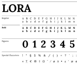
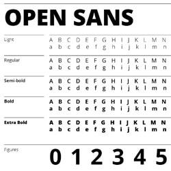
I aligned the fonts across the digital properties to a more modern typeface with many weight options that have an easier readability.
Since the markets we serve and the target customers are so vastly different, I wanted to create some ways to better connect our visual message under one brand. By outlining the types of photos we use, icons, illustration styles, we were able to establish more consistency. To further assist the feeling of a consistent brand, I added some elements such as specific textures, gradient overlays, and an angle element.
A visual language isn't the only element that elevates a brand so I worked with the senior content strategist to include a section that outlines the writing style WESCO should use when communicating and developing marketing campaigns.
Application
Roll out to all digital properties.
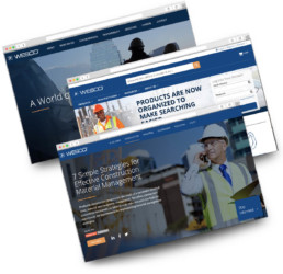
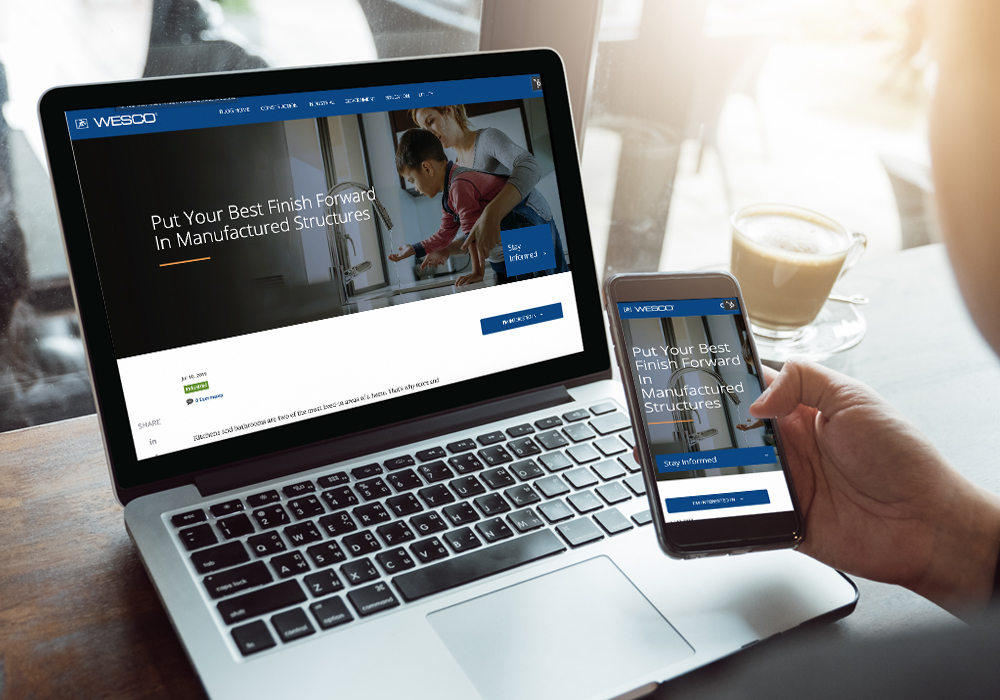
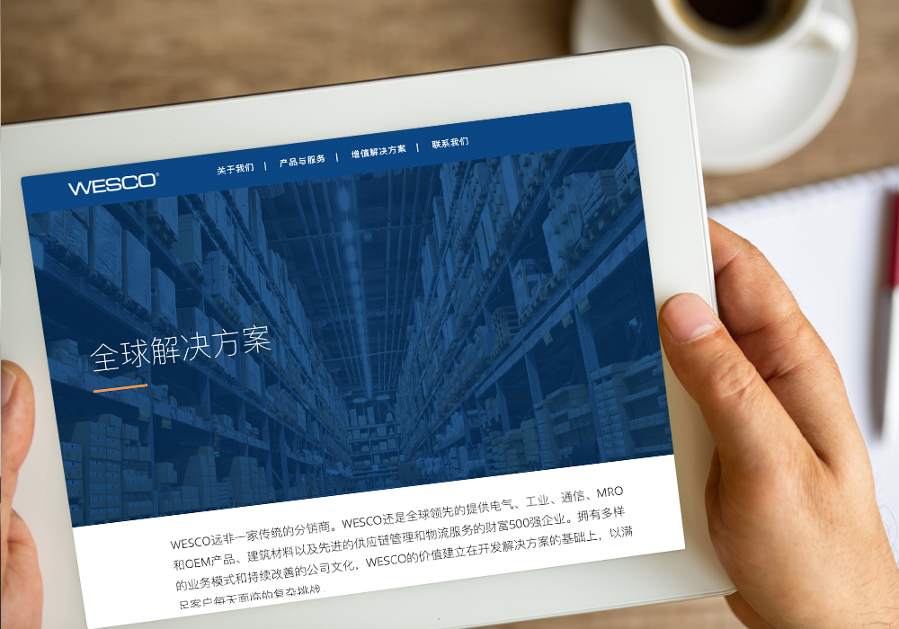
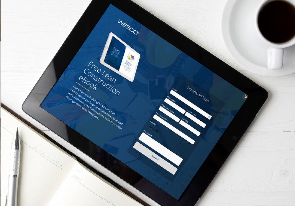
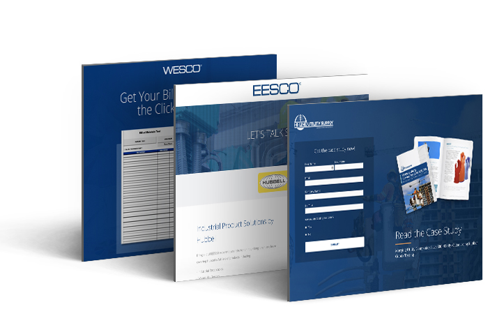
With the digital style established, we began rolling it out to all of the projects that we were working on. We provided it as a tool to our partners and agency we worked with, including the redesign of the corporate website and refresh of the eCommerce site when they made it responsive. I led the design and launch of the blog to harmoniously fit with these other properties.
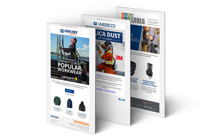
The style guide also informed the design decisions of additional subsidiary websites, marketing emails, landing page templates, and social properties.
ongoing adoption
Developing a user-friendly library.
To increase efficiency and empower those who aren’t designers/coders to participate in the process, I developed an online library of elements and assets that are most often used for branding digitally. All files are downloadable in a number of formats as well as code on how to implement where needed. This is phase 1 of a larger plan to develop an atomic design system that will serve as a single source of truth for digital brand elements to improve consistency and efficiency.
WESCO is a Fortune 500 global leader of electrical, industrial, and communications MRO and OEM products, construction materials, and advanced supply chain management and logistics services. With a strong portfolio of businesses and a high-performance continuous improvement culture, WESCO’s value proposition is founded on developing solutions to satisfy the complex challenges our customers face every day.
ClientWESCO DistributionServicesBrand | Design SystemYear2016
